Take Back Facebook
Those of you who know me well are probably aware that Facebook and I have beef. Well, Facebook couldn’t care less about me, but I have a problem with Facebook. So I’ve decided to actually do something about it, instead of changing my profile picture everyday (topic of a future post). To that end, I’ve created Take Back Facebook.
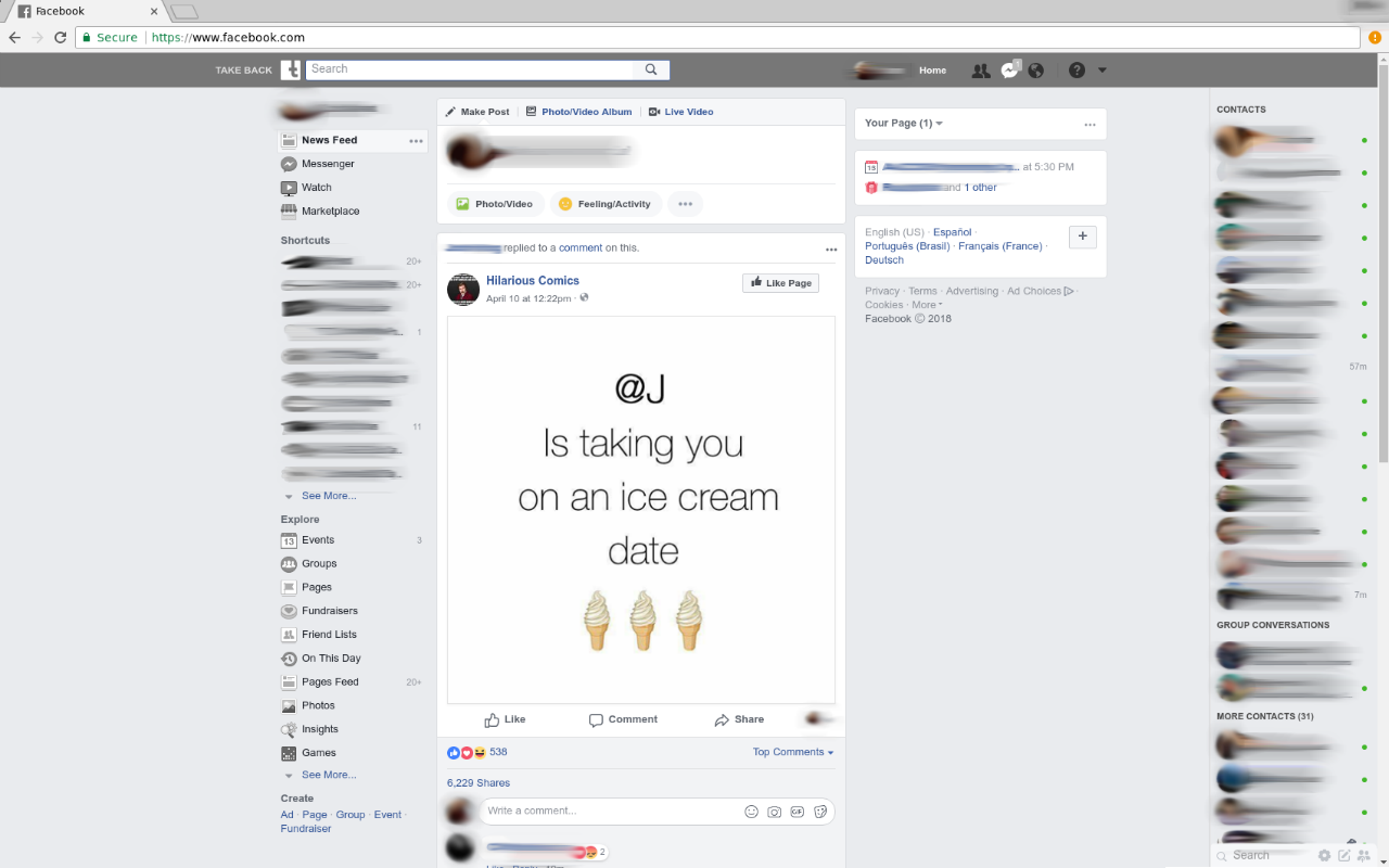
So what, exactly, is my problem with Facebook? Well, study after study after study shows that Facebook makes you unhappy (I found these three within minutes of googling, I’m sure there are many more). Among my friends and classmates I see people sitting in lecture, laptops open, Facebook pulled up, scrolling past an endless feed of cooking videos, “@A has to buy you applebees” and vacation photos. I know people who fret over the number of likes their most recent profile picture is receiving, or spend a day of their vacation trying to take a newer better profile picture. Walking through the library on campus I see student after student with their books open, lecture slides open, notebook open - and are idly scrolling through Facebook on their phones. Facebook blockers are a dime a dozen, but most people I know don’t use them anymore because they always ended up disabling them…
Facebook isn’t all bad. It can be a tool to keep up with family and friends you don’t have frequent contact with. People use it to organize and find events or parties or concerts. You can chat friends! Facebook was, once upon a time, a tool, and a useful one at that. Why has it become such a soul sucking waste of time now?
Certainly a large part of it is due to the Skinner Effect, the need for social validation, the memes, etc. But Facebook also pulls a wide variety of UI and color tricks in order to keep you on the website as long as possible. Things like real time popups, a carefully tested and selected blue, and infinite scroll are all great examples of the psychological tricks they play. But what initially got me interested was from an article that mentioned something curious about Facebook’s initial design choices:
designers initially decided the notification icon, which alerts people to new activity such as “friend requests” or “likes”, should be blue. It fit Facebook’s style and, the thinking went, would appear “subtle and innocuous”. “But no one used it,” Harris says. “Then they switched it to red and of course everyone used it.”
And so Take Back Facebook was born. Take Back Facebook is an open source Chrome extension that makes Facebook’s notification icons gray. But that’s not all! From the readme:
* prevents number of unread notifications in tab name
  * seeing number of unread notifications while in another tab trying to focus is very distracting
* prevents tab name from changing when a user messages you
  * similarily distracting
* gets rid of pop-ups on the bottom left and on the top right
  * popups are an unecessary call to action to try and get you to engage more - the notification bar takes care of informing you that something has changed
* makes the whole title bar gray
  * Facebook's blue is a very carefully handpicked shade, designed to engage users further
* gets rid of trending topics
* gets rid of game ads
* and more!
The other big thing I’m proud of is freezing the title bar (the first two bullet points in the readme). That’s highly distracting while working on something in another tab.
Here’s a screenshot:

And some close ups:

![]()

I think it’s also important to emphasize that, at this time, Take Back Facebook does not mess with your timeline at all. My intent here is not to get people off Facebook, it’s not to be their nanny and block them from using it, it’s to allow people to use it on their own time as they please - not as Facebook pleases.